 Michael here:
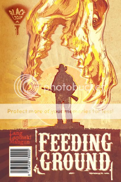
Early on, I became fixated on an image for the series that would have its own iconic weight worthy of images like those used for Jurassic Park and Jaws. What I wanted was a Dia de los Muertos animal skull devouring the sun and a silhouette of one of our lead characters. Not surprisingly, people mistook the skull for that of a dinosaur.

I tried a fix in which I altered the skull to seem more like a spectral image, some heatstroke nightmare.

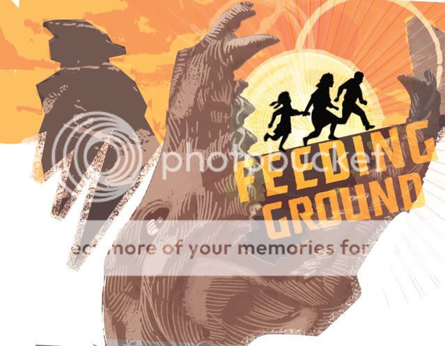
Ultimately, we decided to continue to work the image and communicate the following qualities: horror, Mexico, family, border crossers (our family starring as the silhouettes in the Border Crossing road signs), and unbearable heat.
The following two covers seem a little too much like old Del Rey paperbacks in their layout but pointed us in the right direction. The skull from below may seem a little literal as a "feeding ground" but still appealed to me too much to abandon. Also lost the "Western" treatment of the title in favor of something more industrial.


And this last rough was a bolder departure in which I mined the design elements for a full cover spread.

The final version will be publicized shortly and I think it hits the right balance of what we're going for and will hopefully stand out on the racks. We've also struck on an overall treatment that is more like a woodcut print that, along with the skull motif, should carry over to all six issues of the mini.

No comments:
Post a Comment