Friday, December 31, 2010

2010 _ Blacklight Bites

MICHAEL here:

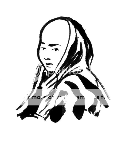
I posted a deeper (longer) reflection on the year on my art blog Paws as Hands but I wanted to add a few quick hits here for some standout Blacklight moments:


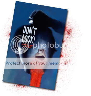
- Seeing our first collaboration, Chris' short FROZEN DARK, published and collected as part of the DON'T LOOK! Anthology. Editor Rick Ritter is a co-worker who was one of those guys who initially poked me to start doing comics again. The final product is a quality, diverse collection that includes a number of other friends, old and new. Plus, I thought that Chris came up with a great title in DON'T LOOK! and Dave Palumbo wrapped it all in one striking cover. Looking forward to more from the LAST MINUTE COMICS crew.


- Traveling to San Diego with Swift for the Convention. From the moment we landed it was an adventure. The streets were thick with fans and our local driver/ friend/ escort yelled at them all the way. From Backstreet Boy bracelets to Wolf Costumes to Gorging on Tapas to Our Chat with Steve Lieber to He-Man Dioramas to Our First Signing and Panel to the After Party with Archaia peeps it was an unforgettable whirlwind not even two days full.


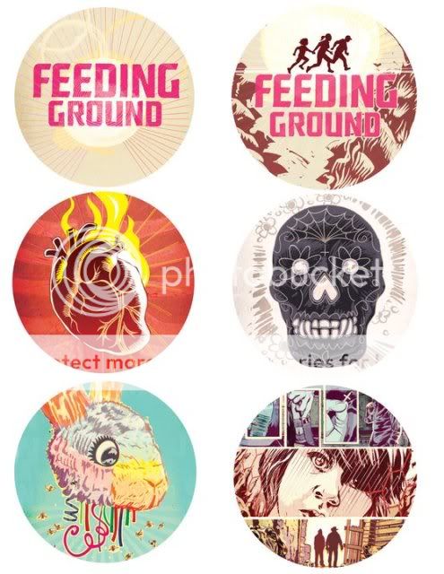
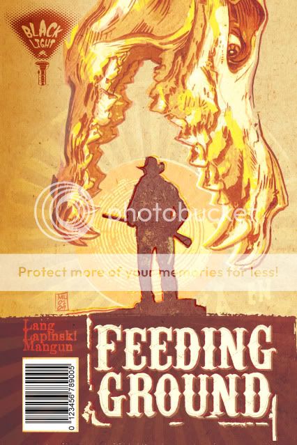
- That a random Facebook post about my cat reconnected me with Nathalia Ruiz Murray, who now could not be a more perfect fit as translator on FEEDING GROUND. She's taken on the role of a diligent writer and linguist who brings so much to the book and ensures more than some rote dictionary translation.


- Being a regular listener of the INK PANTHERS Podcast and then being invited on as a guest. Ostensibly a comic podcast, it's hardly ever about comics and it's more about the banter of the hosts. The funniest thing I listen to every week.


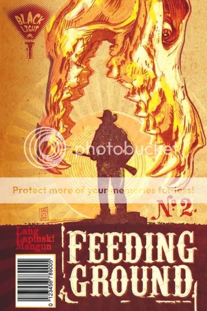
- Our most recent meeting at my home to discuss the beats for FEEDING GROUND #5. It not always easy to collaborate with friends but we've worked hard to be respectful of each other's working style and schedule and tastes. With this meeting I think we hit a groove that was apparent, asking the right questions and field testing solutions to make sure they held water. A perfect end to the teamwork of this year and standard to continue in 2011.

Thursday, December 30, 2010

The Art of the Small --- Looking Back on 2010


By Chris Mangun

I work in Pharma Advertising... the fine print industry. One day, one of our best art directors Huy Hygen (who’s name is pronounced We Win and most enjoyable to say)… anyways, we got into a conversation about fonts and how hard it is to choose the right font to go with the right art. Whether recognized or not, Helvetica feels different from Eurostyle, some might say, more minimal or genteel than the latter. Out of the conversation came the notion that, “People spend more time per capita focused on words than images since they must read letters.” Typography opened my eyes to how every shaped letter is its own piece of art and that someone spent years working on this alphabet, maybe a whole 2 weeks on the letter G! Golly-gosh, someone even made a movie about it “Helvetica”… a splendid documentary on fonts if you’re interested.

I mention all this because a lot of my work on Feeding Ground is lettering each issue. Every month, my eye goes to the screen for hours, tweaking little letters, judging font size, considering spacing, etc. In those hours of work, I sometimes would stop and ask myself, how important is lettering? Do people really care if we use CC Gibbons or Spooky Art over Times Roman? And the answer was always the same, yes. When it comes to comics, choosing the right font is cornerstone to setting the right tone or feeling of a visual story.

This year, I learned why balloons have their own “Live” or “safety” area, which is the distance I want to keep the text from edge of the balloon. Being without special effects of TV or sound, I learn that changing a word’s color or outlining it to stretch it, or making it into sound effects can change the way someone feels or even hears a word. The biggest challenge I had in lettering, what made me really focus in on this little art, was working with accents on the translated flip-side of our issues. Español has accents over certain letters, reverse punctuation, and for whatever reason well styled comic fonts are lacking these accents. This means, I had to place individual “tildes” over dozens of ñ’s and accents over many other letters.

Lettering really is the art of the small… that background craft of creating finely fixed symbols, tiny canvases of meaning, well placed amongst bigger meaning. The best at this craft, allow readers to feel something without having to knowingly feel it.

What I know about lettering comics I learned through “DC Comics Guide to Coloring and Lettering” and a lot working with Michael Lapinski who has built up a great awareness to the art of the small and coached me when I needed it. This year, like lettering, had so many small moments. Many were spent working on this fine comic, which taught me about collaboration with friends and looking closely at how beautifully complicated pockets of time can be summed up in a few well designed words.

Wednesday, December 29, 2010

Reflections on 2010

Swifty here-

Learned so much this past year, and wanted to take a moment to reflect on what this year has taught me. 2010 has been an absolute blur, so I felt a stream of consciousness-style response is most applicable.

Listen to your artist when something isn't working, you really share the same end goals. Read the reviews, sometimes they sting, but this can be the most objective feedback you get. Be true your intentions. You are doing this because you have something to say. Try to tackle something current, but make sure it's personal.

Remember how fortunate you are to be a part of the comics community. I have met many in the industry whose talent is matched by their generosity and intelligence. Read widely, beyond comics. How else is your work not going to be solely referential.

Try to engage the people who are supporting your work as opposed to waiting for an introduction. Ultimately the work should connect you with like-minded people. Talk to people who do not read comics. I've gotten some of my best ideas that way. Be willing to fail, it's the only way you have a chance at success. Remember to love doing the work, at the end of the day, it is the only thing in your control.

Wednesday, November 24, 2010

THANKFUL


FEEDING GROUND #1 has been shipping across the country these last few weeks and it has finally landed on our home coast. In honor of the book's release and tomorrow's holiday, here is our THANK YOU page text as it appeared in the back of the issue. Happy Thanksgiving to you and your families.

It might not be customary to include "thank yous" in the
first issue of a comic but this was a labor of love almost
two years in the making. It would not have happened if
not for the people below and we'd like to express our
gratitude.

As a group, we benefited greatly from the insight and
experience of Thomas Peyton, the counsel of Suzana
Carlos, and the encouragement and camaraderie of artist
Juan Doe. Great thanks to everyone at Archaia not only
for taking a chance on us, but also offering advice and
support that recognized what we were doing and then
made it stronger.

SWIFTY LANG would like to thank the following people:
I would like to thank my parents, my brother David and
sister Samantha for believing in me. I would like to thank
my Uncle Neal for giving me the GI Joes that kept my
imagination rollin’. I’d like to thank my cousins B.B. and
M.B. for proving that writing can be more than a hobby. I
would like to thank all of my friends in Hollywood, Florida,
NYC, LA and world-wide. I’d like to dedicate this to my girl
Spooky, for listening without judgment, reading every
draft, and putting up with a grown man arguing about
werewolves when he barely had a job.

MICHAEL LAPINSKI would like to thank the following
people: Cartoonists Rick Ritter, Mike Dawson, GB Tran and
the guys of MAMMAL, their art and dedication convinced
me to get back into making comics. Paul Zdanowicz,
horror guru and Lapinski-booster with a keen critical eye.
Klaus Janson, whose professional instruction came just at
the right time to bring structure and rules to what I had
been discovering on the page. Brian Michael Bendis for
providing the Jinxworld message board and its posters for
keeping me company in the solitude of my man cave. To
my parents and family, whose generous affection has
always allowed me to thrive. And, to Lindsay, thanks for
adding sweetness to my life and for riding this wolf with
me to Bayonne and beyond.

CHRISTOPHER MANGUN would like to thank the following
people: His father Rick, who taught him craftsmanship. His
mother Kathie, who taught him how to work with people.
His sister Jenny, who open his eyes to ideas and music at
the right time. His brother Rob, the best entertainer he
knows. His Uncle Tim, for evoking storytelling as an
important part of him. And most of all, his best friend Mel,
who believed in him through unbelievable weekends and
continues to do so with kind support. Also, Pale Ale beer...
Yes, he know that's not a person, but it is a friendly spirit
that sometimes helps grease the pleasant grind of
so-called-life-events.

Finally thanks to YOU, the reader, for giving this a shot and
holding this in your hands. CHEERS!

Friday, November 5, 2010

KING CON _ The Blacklight Table


We're going to be at King Con comic convention in Park Slope, Brooklyn this weekend and you should too!

Our very own Blacklight Comics table will feature periodicals FEEDING GROUND and horror anthology DON'T LOOK! (we did the short FROZEN DARK) as well as the snazzy buttons (made by The Angry Robot and featuring Cover and Interior Art) and T-Shirts (printed by Fast Custom Shirts and based on the cover to Issue 3) you see below.


And... Pulparindo!


This Pop Tart of a Con poster is by talented cartoonist and friend, GB Tran.


Tuesday, October 19, 2010

Revision...Taming the Beast


Swifty here-

The act of collaborative writing seems potentially disastrous. How is a unified character psychology established? How does one decide upon motivation, action, a characters voice etc. The process is wrought with frustration.

One of the things we have done is establish "kill cards" and "save cards" in which we are each allowed through democracy to kill those bits of story that are simply not reading well. If the writer is responsible for killing their darlings, we have set-up a firing squad. Ultimately, as a writer, it is important to always remember that your team has the collective goal of telling the best story possible, and not trying to tell their story.


With comics being a visual medium, pace is king, and conveying the most efficient flow of visual information is ultimately the most effective way of telling a story. Personally speaking, because this is my first go at creating a comic, my first draft of issue 1 was so packed with narrative information, the story ultimately was plotted over three issues. The revision was necessary, and allowed the story to breathe in a way that created a far more compelling narrative. The rewriting process for issue 1 took a year. Issue 4 has been written in under a month. Our work flow is improving.

One of the steps that allowed for this new efficiency has been employing the Marvel Method. Michael, Chris, and I will sit down together and beat out the plot points. From there, Michael will establish how much real estate panel wise I have to establish the emotional moments of the scene and convey the most information possible in the fewest words. I have a tendency to pack my panels and that doesn't always hit the mark. Comics has forced me to really layer my work and infuse each word with meaning so that it's echoes are felt throughout the entire series. It is a process more similar to constructing a poem than to telling a story. There is little room for digression.

After the draft is complete, it's time to bring in the firing squad, the only exception being, I know exactly where the bullet is coming from.

Sunday, October 17, 2010

FEEDING GROUND _ Press and Reviews

This post will be treated as a catch-all for links to online interviews, criticism, and feedback regarding our first comic mini-series FEEDING GROUND. Click on the hotlinks for the full text and please feel free to let us know of any we've missed.
---------------------------------------------------------------
AIN'T IT COOL NEWS - By Ambush Bug
July 2011


One of our favorite critics, and a storyteller in his own right (check out his totally unique Vampire series Nanny & Hank), Ambush Bug sat down with us during SDCC back in 2010. Publishing his interview one year later has offered us a great perspective on how far the project has come.

INTERVIEW - (excerpt) - "...an original and extremely well crafted take on werewolves and the Mexican border."
----------------------------------------------------

GEEKS OF DOOM - By The Insomniac
April 2011


The Insomniac had a chance to sit down with the first four issues of the book and offered this thoughtful review.

REVIEW - (excerpt) - "Feeding Ground is a top rate comic and unique idea."

------------------------------------------------

FANGORIA - By Jorge Sollis
April 2011

Fangoria is considered by many to be the bible of horror news and reviews. They've been doing it for over thirty years. We were deeply honored to receive this excellent review.


REVIEW - (excerpt) - "Readers will no doubt be discussing their opinion on the topics lurking within the pages. Comic book fans are given a chance to think and be entertained at the same time." 

-------------------------------------------------

THE PULLBOX - By Eric @The Pullbox.com
March 2011


After a conversation with Chris Mangun at C2E2, Eric penned this excellent review of FEEDING GROUND.


REVIEW- (excerpt) - "...the emotion and characters are so solid and genuine that they should not be overlooked when reading the entire tale.  Even in light of the conflict in-between border patrols and out of control lycanthropes."
--------------------------------------------------


MTV GEEK - By Charles Webb
January 2011


Swifty had a chance to chat about FEEDING GROUND with then newly-launched MTV Geek. With a veritable roster of comic powerhouses, it was an honor to be included at the party, even briefly. Below is an excerpt of the interview.


INTERVIEW - (excerpt)- "...The idea of transformation, the most integral part of the monster, struck me as something not only corollary but, integral to the crosser’s journey of seeking out a new life... How does one survive and what is their reason to continue?

---------------------------------------------------------

RENDERWRX PRODUCTIONS - "COVERLESS" Reviews December, 2010

REVIEW - (excerpt) - "Quality book, I give it 5 stars across the board and am eagerly awaiting future issues. Thanks Archaia for turning out great book after great book."
-----------------------------------------------------


THE OUTHOUSE - "Fourthman Reviews" by Lee Newman
November, 2010

REVIEW - (excerpt) - "It's a blessing that Archaia and other companies are out there exploring the boundaries of the medium – just like the indie films and book publishers do for the more mainstream media outlets."
------------------------------------------------------

COMIC RELATED - "Why I Love Comics" by Eric Ratcliffe
October, 2010


Eric has written some of my favorite reviews of some of my favorite comics (Hawkeye & Mockingbird, Sweets) and now he puts words to FEEDING GROUND #1. I especially appreciate how he related to our presentation of family in the book.


REVIEW - (excerpt) - "My verdict is that if you enjoy books that explore the human condition as well as add plenty of mystery and a little bit of suspense/action I really think you'll enjoy this. I can happily say I have no idea where they are taking this but I sure as hell am in for the ride! "


------------------------------------------------------

AIN'T IT COOL NEWS
October, 2010


The premiere website for fan culture gave an amazing post-NY Comic Con review of Issue 1, calling the book "one of the cooler books of the con" and "unique in almost every way." REVIEW - (excerpt) - "Take my word for it, seek out FEEDING GROUND. It works as a political commentary ripped from the headlines as well as a nail biting horror/thriller. Highly recommended."


------------------------------------------------------


WHERE MONSTERS DWELL - Episode 121
October, 2010


All three of us were featured guests on this weekly pop culture radio show. Great banter and a casual conversation with the guys about NY Comic Con and our pop culture influences.


LISTEN HERE:
http://wheremonstersblog.blogspot.com/2010/10/episode-121-with-creators-of-feeding.html

------------------------------------------------------

THE NEW YORK TIMES

October, 2010


This little local rag did a feature on "comic-related gems" in NYC and included Bergen Street Comics in Park Slope Brooklyn and a pic of our FEEDING GROUND launch at the shop. The store is the closest thing we have to a Comics' Salon frequented by professionals and an educated and enthusiastic readership. And, it's a great-looking space to boot.


------------------------------------------------------

WEREWOLF NEWS

September, 2010
Andrew at Werewolf News is someone who is about as informed and passionate about all things werewolf as you can get. He was cool to feature us on his site both in an introductory post and probing Q&A that delved into the nature of the contemporary werewolf myth we are in the process of revealing.

INTRO - (excerpt) - "The Wrong Night in Texas told its werewolves-in-the-desert story with manic energy, but every panel of Feeding Ground is a slow burn. The heat, desperation and simmering violence of the Busqueda family’s world is evident in every stroke of Lapinski’s artwork and word of Lang’s writing."


Q&A - (excerpt) - "While our comic acknowledges a rich back-story of the historic collision of pre-Columbian and European myths present in this region our comic is set firmly in the present. It deals more with modern themes such as Capitalism, which has created new circumstances for both the rich and the poor and thus requires new acts of rebellion, new kinds of myths."


Also great feedback from a reader who commented "Consider me sold, guys. Even more than concept or artwork, seeing the amount of thought you’ve put into your work has got me eager to read." ------------------------------------------------------


THE INK PANTHERS SHOW - Episode #53 August, 2010
Already a fan of the podcast (a "fanther") Michael has the chance to guest star with cartoonists/ hosts Mike Dawson and Alex Robinson and chat about veganism, San Diego Comic Con, and the origins of Swifty Lang.


LISTEN HERE:
http://www.mikedawsoncomics.com/the-ink-panthers-show-53-featuring-mike-lapinski/

------------------------------------------------------

THE COMIC BOX

July, 2010
Our first bit of coverage came in the form of an interview and early review from The Comic Box, William Kulesa's weekly comic feature in The Jersey Journal and on NJ.com. Michael had the chance to shout out a number of influences and supportive folk and the review let us know that the material was on the right track in terms of the particular type of horror we were gunning for.


Interview with Michael - (excerpt) - "Any work of horror needs to have a central anxiety. In this case it’s the inability to provide for your family. Regardless of your feelings about the politics of the region, the central truth is rooted in people on both sides of the border merely trying to get by despite all of the forces conspiring against them."
Review - (excerpt) - "True horror is far greater than the fear of a monster or even something so simple as death. It is this encompassing of innumerable meanings of horror that "Feeding Ground" does so well, even in the first issue."

Sunday, August 15, 2010

FEEDING GROUND _ Our First Review!

MICHAEL here:

I'm currently wading in ink trying to finish up pages for Issue 3 but I thought I would share links to our first bit of press for FEEDING GROUND.

Both come from the Comic Box column in The Jersey Journal and NJ.com written by William Kulesa. When I was living in Brooklyn, my dad had been cutting out columns of William's reviews for me and it was surreal to talk with him and be featured in the paper.

The first is a personal profile/ interview (complete with picture!). So cool to be able to share some early influences and talk a little more about the pitch process.
http://www.nj.com/columns/jjournal/i...900.xml&coll=3

And THIS, is one helluva well-written review. It's our first one and such a relief to hear that someone understands what we are going for and that we are delivering on the page. I realize that we will be getting some negative and middling feedback but this one certainly speaks to our intentions and is a warm welcome into the world.
http://www.nj.com/columns/jjournal/i...240.xml&coll=3

Get a load of this excerpt:

"True horror is far greater than the fear of a monster or even something so simple as death. It is this encompassing of innumerable meanings of horror that "Feeding Ground" does so well, even in the first issue."

Thanks to William, the Jersey Journal, and my partners Swift and Chris!

Monday, August 2, 2010

FEEDING GROUND _ Solicitation and Podcast

Michael here:

In case you missed it, here you have the solicitation for FEEDING GROUND Issue 2 and a link to my first Podcast appearance! With this cover image, I was trying to create a new doomed iconography based on the Christian symbol of the Sacred Heart as well as the Mexican lotería card for "Corazón" to communicate the cursed blood that flows within.


FEEDING GROUND #2 (of 6)
Retail Price: $3.95 U.S.
Page Count: 64 pages
Format: saddle bound, 6.625” x 10.25”, full color
Written by Chris Mangun and Swifty Lang
Illustrated by Michael Lapinski
Cover by Michael Lapinski

A local enforcer, Don Oso, terrorizes the Busqueda family as their father Diego makes a solitary trek home through the horrors of the Devil’s Highway. Meanwhile, US Border Patrol agents unearth a shocking discovery that threatens to reveal a secret buried in the desert for generations. Also included are 24 pages of bonus content in Spanish!

T +13 (Contains material suitable for teen readers age 13 and above)


I'm a regular listener to The Ink Panthers Show podcast (a "Fanther") and I was nervous and excited to be asked on as a guest star. Hosted by famed cartoonists Mike Dawson and Alex Robinson, the show is ostensibly a comic book podcast but the topics are all over the map and the main draw is the funny, familiar, conversation held between Mike and Alex.

On this episode, I reveal the details of that crucial moment when Archaia accepted my FEEDING GROUND pitch and then the conversation veers off into other bits ranging from Pixar to veganism and my love of cuttlefish.

You can listen off of their website or download and subscribe to the podcast for free through the iTunes store.

Ride the Panther!

Sunday, July 18, 2010

FEEDING GROUND _ The Pitch


MICHAEL here:

Now that the FEEDING GROUND release date is fast approaching (end of September) I thought I'd cover the structure of our initial pitch.


The first thing we decided was to format the pitch as a comic with cover art and the same dimensions and binding as an ordinary floppy. Any tips we had researched always recommended the inclusion of 5 pages of comic content so this package seemed like a natural fit.

After a title page and table of contents, we immediately went into our proposal. It essentially starts with a two-sentence summary of the concept as a hook, then expands into a one-page description, and, finally an issue-by-issue breakdown on the next page.

We treated the text like any conversation with a stranger. Pique someone's interest at first, and then have the information to merit their attention. And, one important tip we were given was to tell your prospective publisher the ending. Mysteries are good for the reader but most publishers would want to know exactly what they're signing on for.

Also, mythology is not the story. While the story has a beginning, middle, and end, we chose to include a separate page about the overall mythology we were establishing because we felt it was a unique angle on a familiar topic.

From there, we had a page of character sketches and bios and a map to start to populate the world in the mind of the reader. That leads to the section that represents 5 pages of finished material. Of these pages, only one has made it into our final book relatively unchanged. However, an editor will be able to judge basic storytelling ability and execution based on these pages. Additionally, we included a few sample covers to communicate the identity of the series as it would appear on the racks.


Finally, we ended with the full Issue 1 script as well as some additional pin-up art. Unlike screenplays, comic scripts do not require particular formatting but Swifty followed a general screenwriting model. Not required, but we also chose to add panel breakdowns for each page.

There isn't any one correct way to present your ideas, but, this is the one that worked for us.

Wednesday, June 30, 2010

FEEDING GROUND _ Solicitation Update

Some additional backstory: initially, the Archaia website listed the book a 48 pages (accounting for a flip book in which the book is reprinted in Spanish) for $3.95. One problem, our first issue has 28 pages of content (x 2 = not gonna fit). Then, I went to the Previews site (the distribution catalog for comic sales) and discovered that the book was listed at $5.95 (!) and my jaw dropped. After a fitful night's sleep and some phone calls, Archaia is more than on top of resolving Diamond's typo.

In fact, the book will be 64 pages at $3.95. Holeee Mackerel! We were already planning on including some extra content (pin-ups and articles a la Ed Brubaker's incredible Criminal) but I could not hope for a better package for this book. Thanks and cheers to Archaia for taking a chance on us.

One artist that we already have lined up to do some additional art is friend Tom Forget. His work is the best kind of lurid pulp and a great match to the heat of our material. Warning, most of his images are Not Safe For Work but are perfect for your basement office.

Monday, June 21, 2010

FEEDING GROUND ISSUE 01 _ Solicitation

HERE IT IS!

Conceived in the summer of 2008 by Swifty Lang and Chris Mangun, pitched at NYC Comic Con 2009, this puppy has been in production all last year and now has a release date of the last week in September 2010, published by the good people at Archaia (home of "Mouse Guard" and "Fraggle Rock" and some of the highest quality comics of all genres).

Flip the book over, and it's such an amazing decision on their part to include the entire issue in Spanish!

Thanks for your support - please tell your local comic shop to order you a copy today!


FEEDING GROUND #1 (of 6)

Retail Price: $3.95 U.S.
Page Count: 48 pages
Format: saddle bound, 6.625” x 10.25”, full color
Written by Swifty Lang
Illustrated by Michael Lapinski
Cover by Michael Lapinski

This new series is ripped right out of the real-life drama unfolding on the Mexico-Arizona border. FEEDING GROUND reaches a large and diverse audience no matter your personal point of view on the issue. In this factious story, a famine caused by Blackwell Industries drives Diego Busqueda, a noble “coyote,” to lead a band of Mexican border crossers across the unforgiving Devil’s Highway, a desert cursed with blistering days and deadly nights. Back home, Diego’s daughter Flaca discovers that something hungrier prowls the factory fields. Stalked and persecuted, can the Busqueda family maintain their dreams of immigration or will the horrors of the desert tear them apart? Also included is 24 pages of bonus content in Spanish!

T +13 (Contains material suitable for teen readers age 13 and above)

Thursday, June 17, 2010

FEEDING GROUND - Cover Development

Michael here:

Early on, I became fixated on an image for the series that would have its own iconic weight worthy of images like those used for Jurassic Park and Jaws. What I wanted was a Dia de los Muertos animal skull devouring the sun and a silhouette of one of our lead characters. Not surprisingly, people mistook the skull for that of a dinosaur.


I tried a fix in which I altered the skull to seem more like a spectral image, some heatstroke nightmare.


Ultimately, we decided to continue to work the image and communicate the following qualities: horror, Mexico, family, border crossers (our family starring as the silhouettes in the Border Crossing road signs), and unbearable heat.

The following two covers seem a little too much like old Del Rey paperbacks in their layout but pointed us in the right direction. The skull from below may seem a little literal as a "feeding ground" but still appealed to me too much to abandon. Also lost the "Western" treatment of the title in favor of something more industrial.


And this last rough was a bolder departure in which I mined the design elements for a full cover spread.


The final version will be publicized shortly and I think it hits the right balance of what we're going for and will hopefully stand out on the racks. We've also struck on an overall treatment that is more like a woodcut print that, along with the skull motif, should carry over to all six issues of the mini.

Sunday, March 7, 2010

FROZEN DARK _ The Full Mini-Comic

MICHAEL here:

I was never in a band. I never had the after-school garage practices, sweaty basement shows, or packed-van touring. No local fans or feuds among friends. But now, Swifty is right when he says that this Blacklight Comics collaboration is the closest approximation we have to doing the rock band thing. If that's the case, Frozen Dark is our first single.


Here's a LINK to the full comic as a Google Doc. We printed a number of copies for the Big Apple Comic Con and there is still the intention to include it in a friend's horror anthology. This doc is also a temporary home as we set up our main site.


As our first complete story, there's a lot being worked out on the page.

I soon discovered that a cast of young, bald, boys in similar dress was confusing in terms of identifying the players. Although the three main orphans are aged apart, I added a white shawl to our protagonist, Azuba, to better distinguish him with an iconic accent.

In terms of illustration influences, I was clearly looking at Asian brushwork, particularly the Vietnamese artist Huy Toan, to achieve a line that was as loose and descriptive as possible. I believe I succeeded in exactly one panel (which, from what I hear from other artists and on comic podcasts, is a pretty good ratio).


I had always pictured designing the page on biased grids to heighten tension, drive focus, and mirror the driving snow. However, I do think the layout can overtake the story at times and I certainly ran into a number of issues when resolving the design across adjacent pages.

We also started with the initial premise of having to make a midnight bathroom trip in a foreboding landscape. Then, the goal was to build to something more without losing the initial sense of dread. It's especially difficult to surprise a comic reader when all of the panels are already visible on the page. There's the added risk of being too opaque or corny or obvious when handling material that should be horrific.

Please take a look and come back to let us know how it read for you.

If you're interested, I've also discussed the story and toning of Frozen Dark in previous posts on my personal art blog.

Tuesday, February 23, 2010

FEEDING GROUND - The Comics-Related Interview


Hey Everyone, Michael here:

I'm looking to post some of our pitch book art on this blog in the coming weeks but for now I thought I would share an interview I did about the project at the 2009 NYC Comic Con for the comic podcast Comic Related.

You can find it HERE.

Our pitch book was met with a lot of positive feedback and I felt extremely fortunate to be sharing it with comic creators that I have immense respect for.

I was showing it to writer Matt Fraction when one of the Comics-Related reporters saw it and asked me to do an interview as well.

Very cool to verbalize what we were developing in relationship to other horror myths and graphic styles and it gave me the confidence that it was an idea and creation that could potentially sit on a bookshelf next to other comic works.

Monday, February 22, 2010

The Logo- Shining the Light

SWIFTY here:

Blacklight is the outgrowth of the collision of ideas and talents, of a passion for smart horror, and a way to examine contmeporary issues through the lens of 'fringe genres'

As much as anything, our flashlight represents not only the way we view the world, but harkens back to a kid reading the latest issue of Creepy underneath his/her blanket past his/her bedtime.

Horror is the playground where the uncosnscious and the repressed are allowed to stretch their legs. With so much true horror occuring along the actual Devil's Highway, we understand our greatest challenge is not only shinning the light on the issue, but making sure that the shadows of the werewolf do not obscure the truth.

Feeding Ground Origin Story

SWIFTY here:

Firstly, welcome all to the world of Blacklight. I wanted to let you in on our history and how collaboration on Feeding Ground has lead to the best work possible.

Our Origin Story: In the summer of 2007, a friend of mine, Thomas Peyton, an incredible documentary filmmaker recently completed a film on the harrowing journey of a man crossing the border from Mexico into Arizona. His story was riveting and I could not shake it. We also had a conversation on the least represented monster during the Oughts Horror Renaissance. We agreed on the werewolf. He had a great idea for a werewolf story at the time, and again, his words were indelible. The origin of this story is without a doubt based on our conversations.

My background is in film and and my first thought is that this story could be represented best through this medium. I presented this story originally to my friend Chris Mangun and he wanted to help me get this off the ground. For me, telling the story to friends and parsing their reactions is paramount to whether or not an idea is worth pursuing. If you can't hold a friend's attention you will never be able to interest an audience.

As Chris and I began the script writing process, it became clear to me that the mythology of the story would not be best represented through film. There was a certain aesthetic I knew that I simply could not communicate. For me, the Mexican Day of the Dead color palette was essential in rooting this story in a very particular landscape and imbuing it with the sense of horror it needed.

Also, the EC Horror Comics aesthetic I believed could best be expressed through print (although films such as Creepshow, a huge influence, were able to do this successfully). Luckily, Michael Lapinski and I had been friends for a decade.

Michael has been my mentor in the world of comics as I did not become an avid reader until my mid-twenties. I am still constantly exposed to new, great work, and awed at the ability of this medium to create such emotional and visceral moments with such visual economy. I am always open to suggestions for reading so please send them my way.

A couple of years back I had given Michael Posada's book on Mexican Folk art for his birthday. I was floored by the seeming simplicity of the design, the content (fascination with the dead), and the color palette itself. Little did I know how significant the connection would be.

On forming Blacklight: I recognized immediately that what was needed in order to bring this to life was a partnership of all of our talents. Chris and I had talked shop on writing for years (he and I both write ficiton) so our working together was a logical equation. Whether Mike was as taken by the story as we were was the question.

I think what we all recognized was the importance of this story and furthermore, how universal the crossing narrative is. Leaving one's homeland for a new world of opportunity is a universal story as much as anything. I also personally was teaching ESL at the time and was reminded essentially, everyone's family has sacrificed to come to this country. That simple truth is obscured by a lot of xenophobia these days, but that is another discussion entirely.

Each of us brought a unique set of skills and perspectives to this project. So, much like the robot at the top, I knew it was time to 'Voltron'; form something greater with the sum of the parts.